While at human, I collaborated onsite with the OppenheimerFunds design team to create a system of UX designs. The designs accommodated dozens of hypothetical content types. While this basic system was in use by the production team, we jumped into creating a proper design system.
How do you redesign a corporate website without knowing what the actual content will be?
The primary challenge with the design system was to extend the new minimalist branding into a UI toolkit. We also streamlined variations found with different button styles, text sizes, etc. I also unified any inconsistent colors or typographic examples.
The 5-step design strategy:
- Audit existing web pages, patterns, and UI elements.
- Organize groupings and propose a design plan.
- Deploy a basic style guide outline.
- Execute the design plan in phases starting with UI elements.
- Create a knowledge base and populate with content.
Discovery and Planning
I began by taking screenshots of each page and grouping them into folders, while recording the page URLs in a spreadsheet.
Each screenshot was then copied and dissected into smaller parts such as page sections, buttons, and text blocks. These parts were organized into a taxonomy that made it easy for the team to digest.
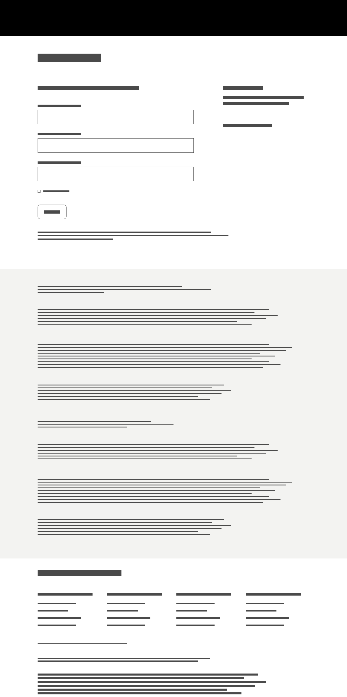
To archive the audit and present the findings, a simple microsite was deployed. The team was able to review the website and determine a plan for the minimum design effort
Several archetype pages were identified. These would anchor the design system, while serving to illustrate working examples. The pages were to be designed at high fidelity using actual content, though the real template work is handled by the "section layouts" and UI elements.
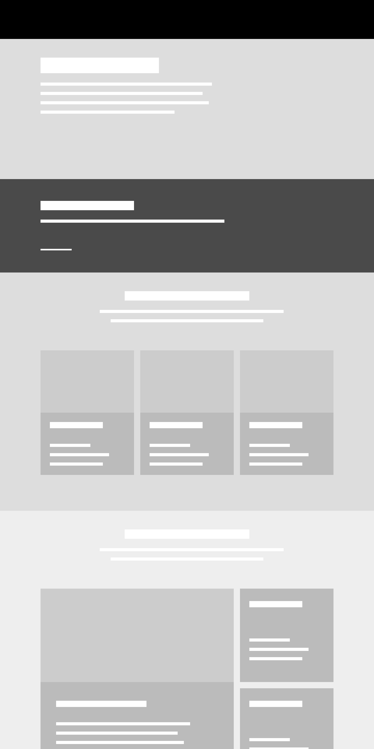
Landing
Dashboard
Article
Results
Forms
Tables
The design plan identified several template archetypes for redesign such as a landing page, form, and table.
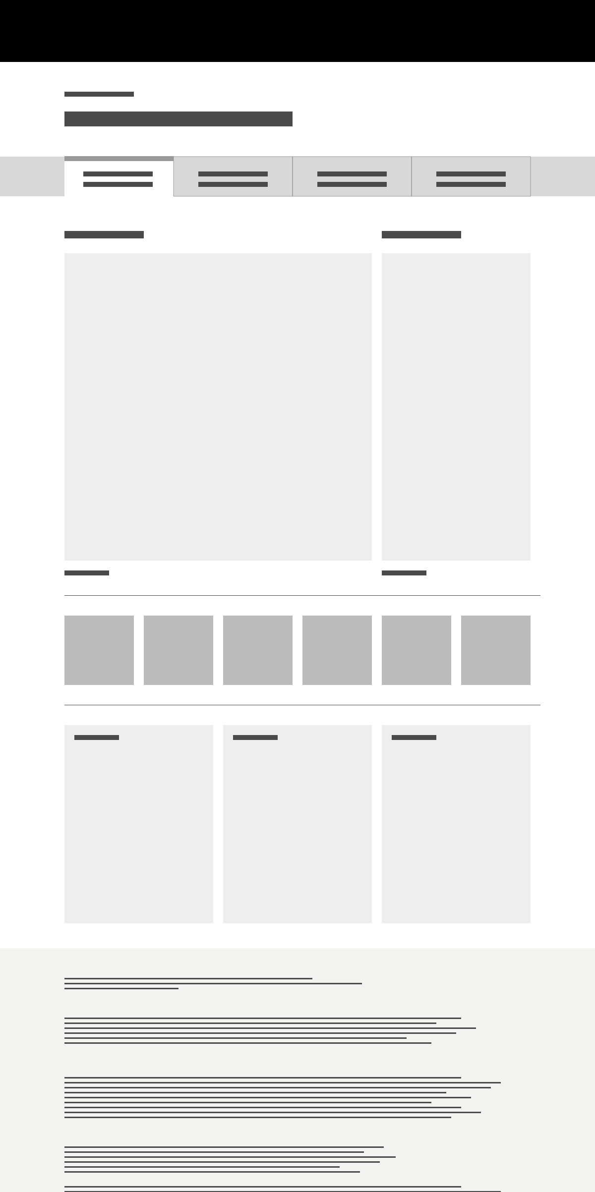
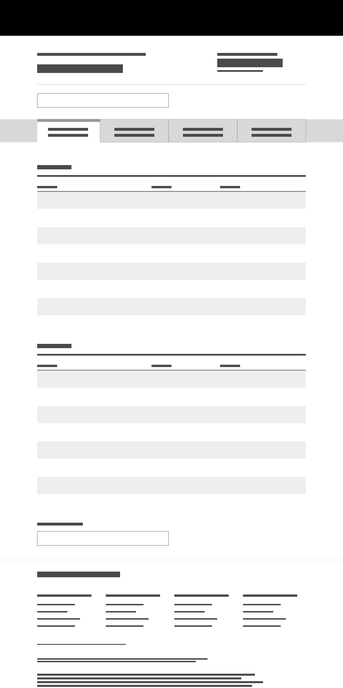
"Section layouts" are templates that contain generic imagery, text, and UI elements in a 12 column grid. Because at the time we had no idea what the final content needs would be, we created as many flavors of sections as we could think of. Sections with 1 column, 2 column, 4 column, with images, without images, inverse color treatments, etc.
After designing each section layout template, we held an intensive weeklong work session alongside the development team, guiding them to implement the template designs within the production environment. With the team now under less pressure, the design team was freed up to start the design system.
Designing the System
My charter and core objective was to streamline plus unify existing elements. The secondary objective was to expand the UI toolkit to including elements that are missing or otherwise useful. Seeing all the UI elements next to each other revealed gaps in the UI toolkit, much like a periodic table might suggest an element is missing from a certain sequence.
Following atomic design principals, UI elements were designed at multiple sizes, including colors, forms, buttons, tables, and typography.
A mini-audit of the icon system revealed that around 60 icons were needed. Existing online icon sets were scrutinized from a stylistic viewpoint, but no particular set had every icon that was needed. We decided to start with the closest baseline set of existing icons, plug the gaps with custom designs, then iteratively change the design of the whole set until it was more to our liking.
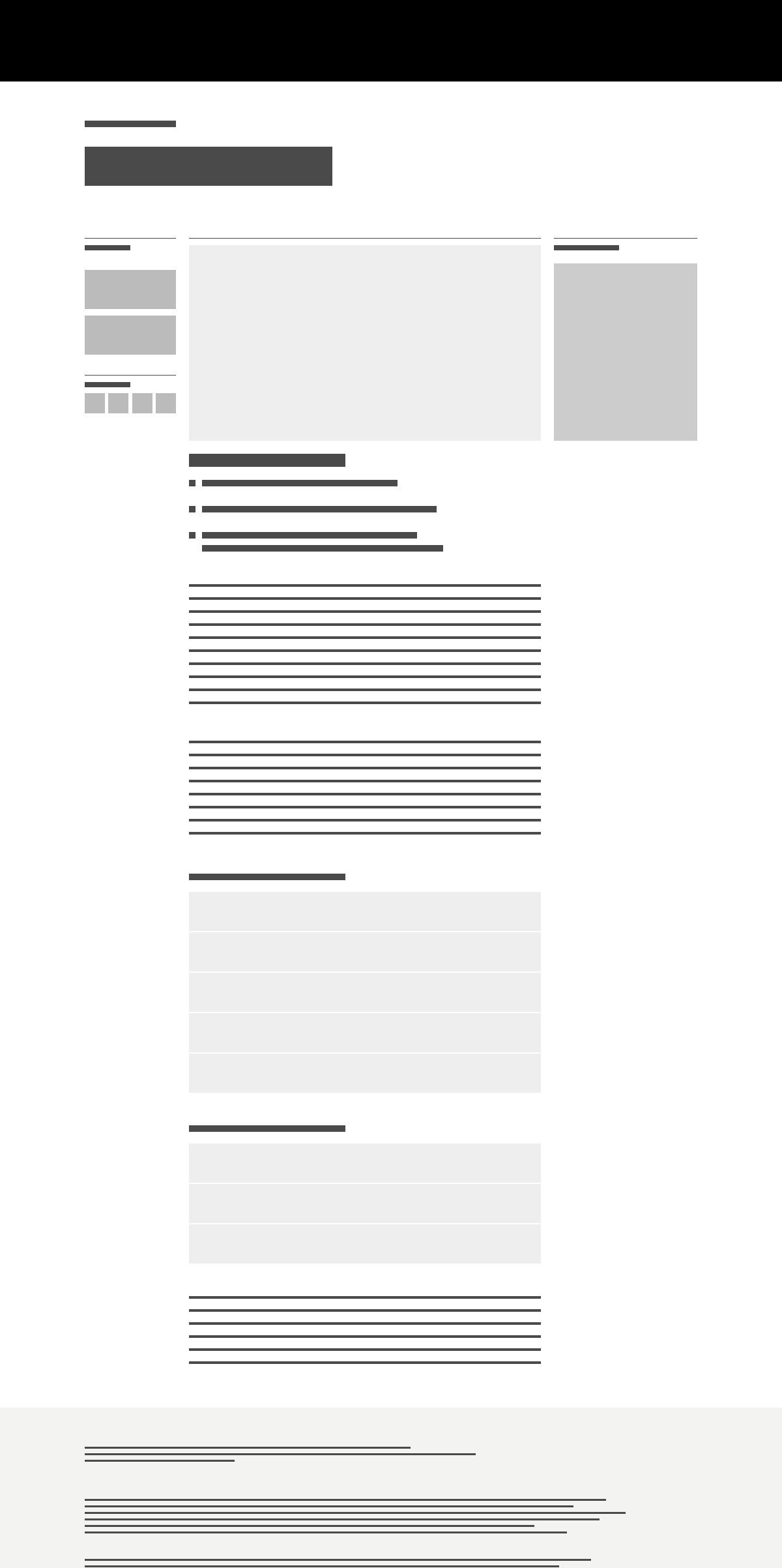
Form
Form Inverse
UI elements are assembled into template archetypes and uploaded to the style guide website, along with a matching inverse style.
UX Design Support
While creating the design system, I split my time designing UX for website landing pages and iPad app screens. While this slowed progress on the design system, it did allow me to pressure-test a practical application of the system's elements in production.
The lesson learned is that it's important to iterate on some final page templates, to calibrate the elements for actual web usage and validate the decisions being made. This is a back-and-forth process from the smallest atomic elements to the largest template organism. As we build out the entire design system, we'll cover off on sections, components, and alternative variations as needed.
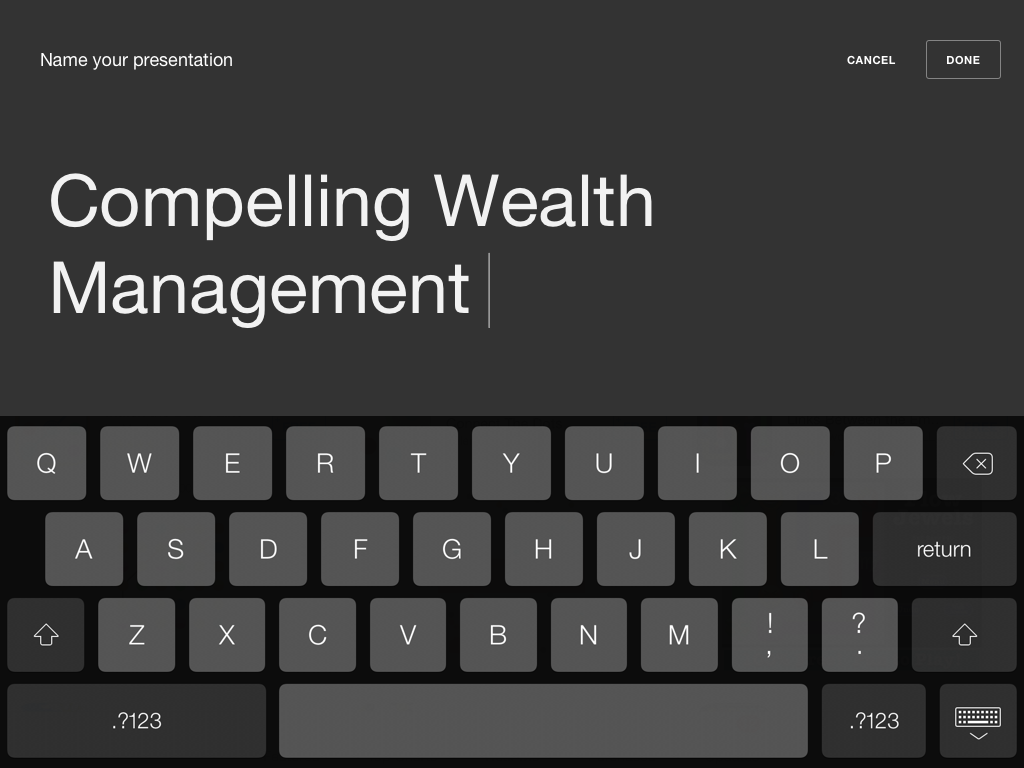
Edit Title
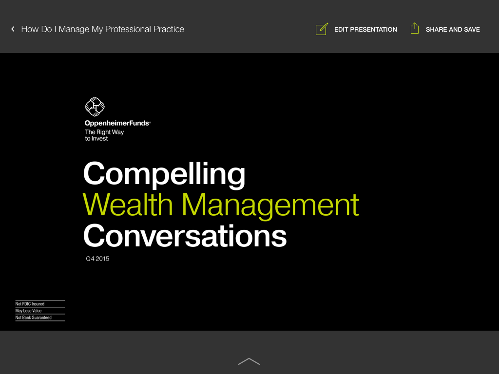
Slideshow (tapped)

Slideshow (swipe up for thumbnails)
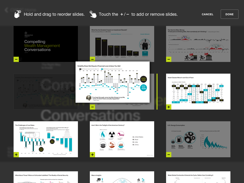
Edit Presentation (dragging to reorder)
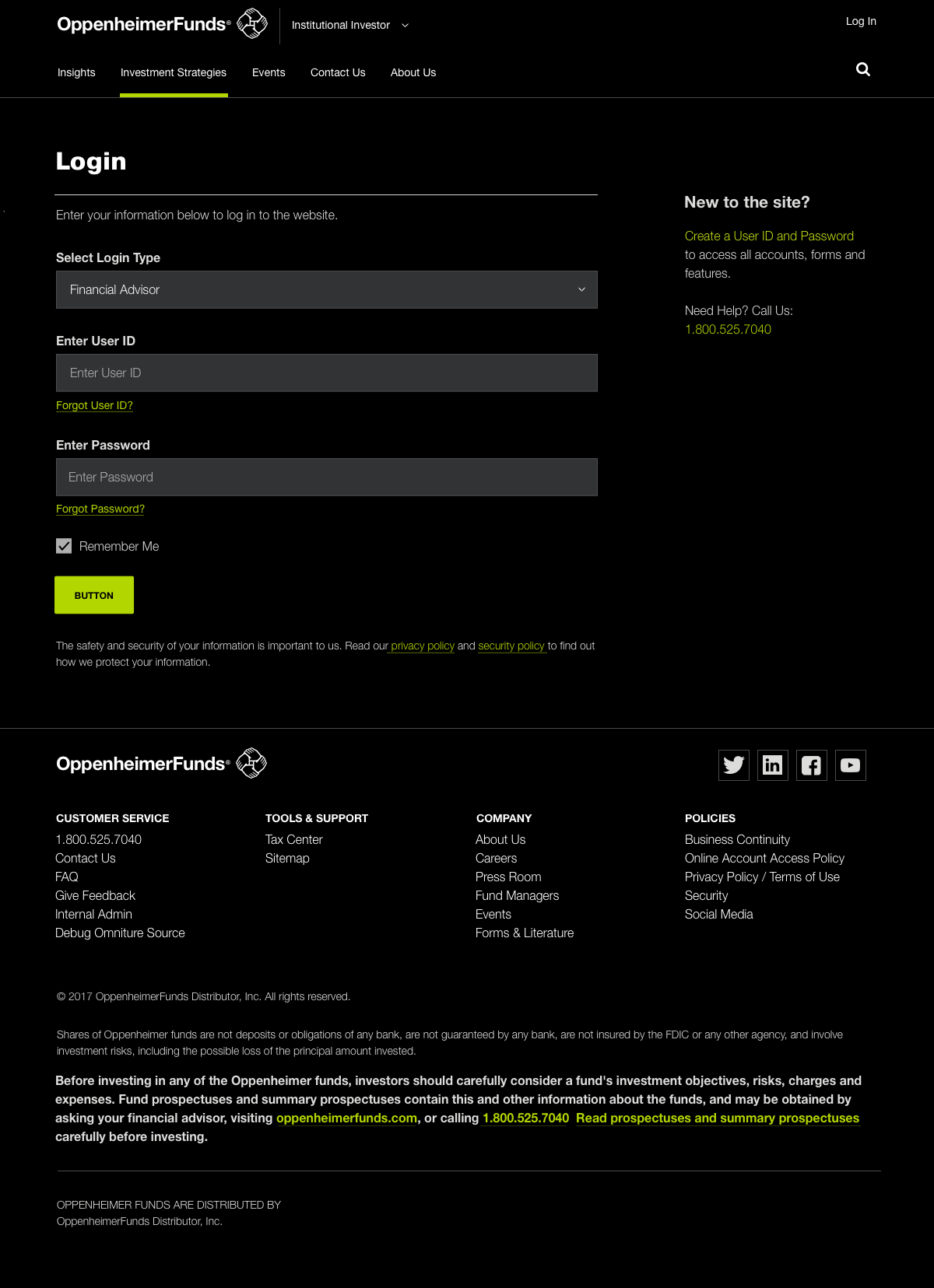
iPad app showing UX examples for viewing and editing a slideshow presentation.