This account was fairly challenging for my talented team of 5 art directors at Human. Related tasked us with redesigning the main website, and creating a series of microsites as well.
A fully integrated online/offline marketing ecosystem.
This was actually the second time I designed it, having been a lead designer on the original version 4 years earlier while at Organic.
The Aesthetic
We pushed for a flat aesthetic that handed all attention to the photography and content. A minimalist use of grid, type, and color lended a timeless quality to the design, which is still holding up quite well even 5 years later.
Design Strategy
Each business team in the organization opted to gather under a single umbrella website, while having different content strategy needs that we enabled with thoughtful art direction and copy.
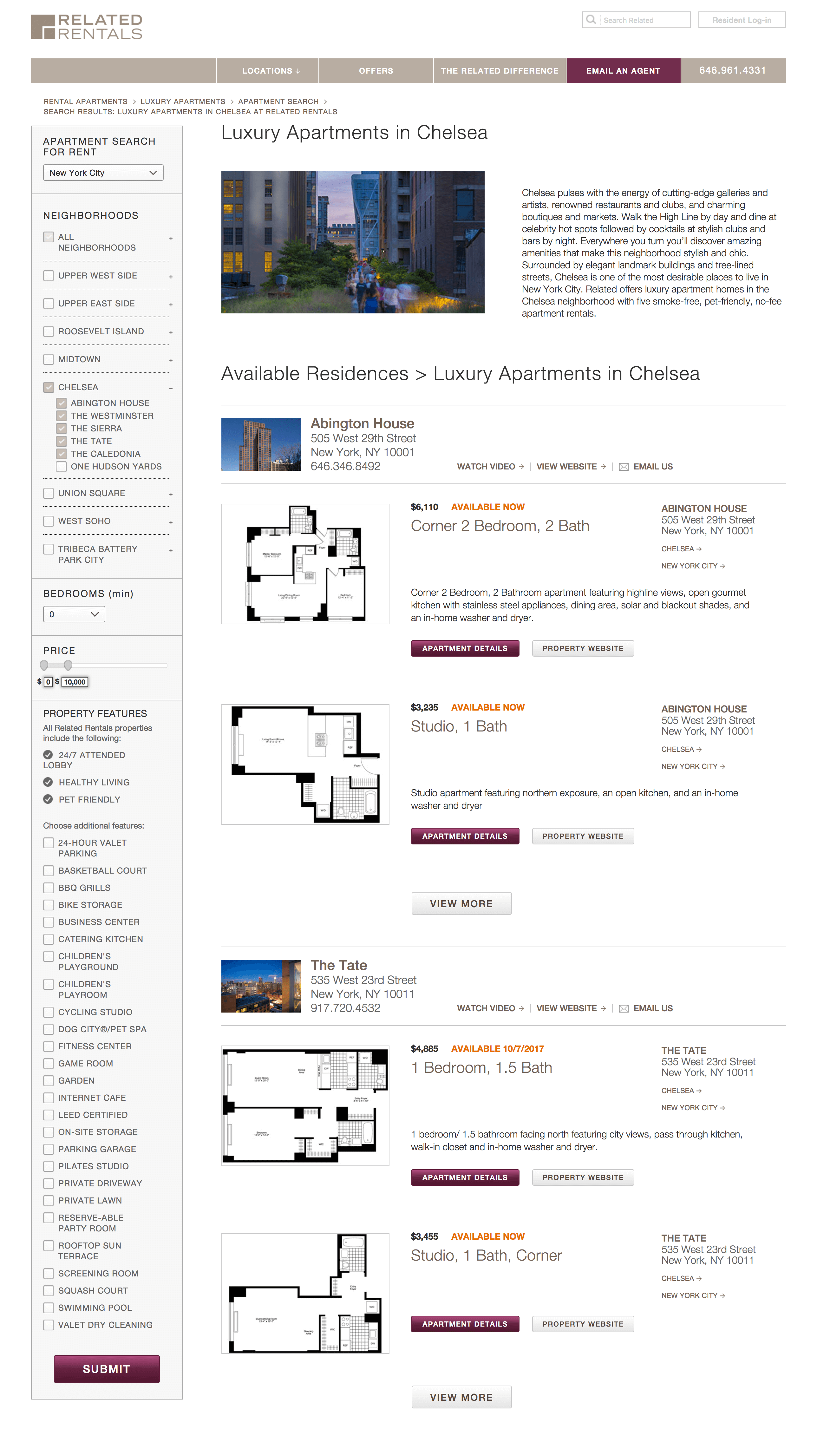
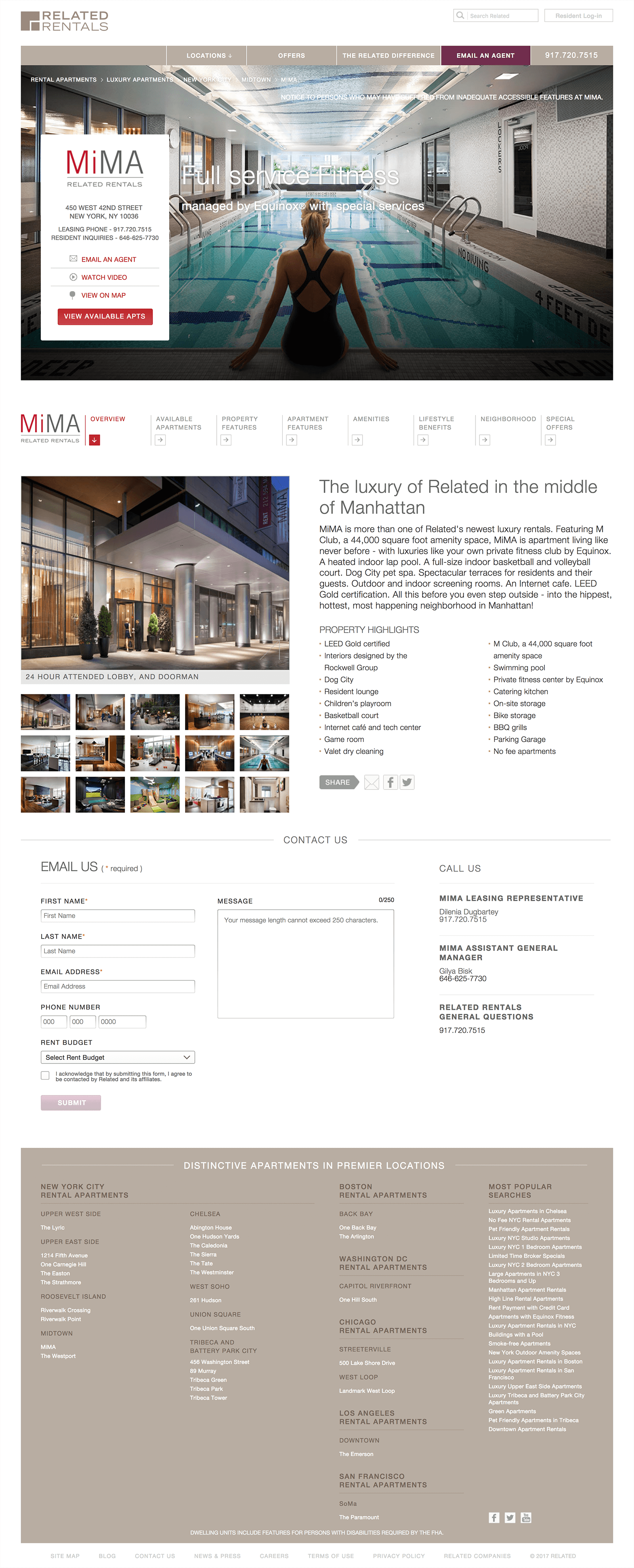
The Corporate team emphasized news, company values, leadership, and the overall business portfolio. The Sales team emphasized street-level beauty shots of building exteriors, and panoramic views from inside the condo. The Rentals team leaned on amenities, neighborhood, and price with photos that emphasized the interiors. The Rental CTAs drove to a "Lease Online" and "Schedule an Appointment".
SEO Search Landing Pages
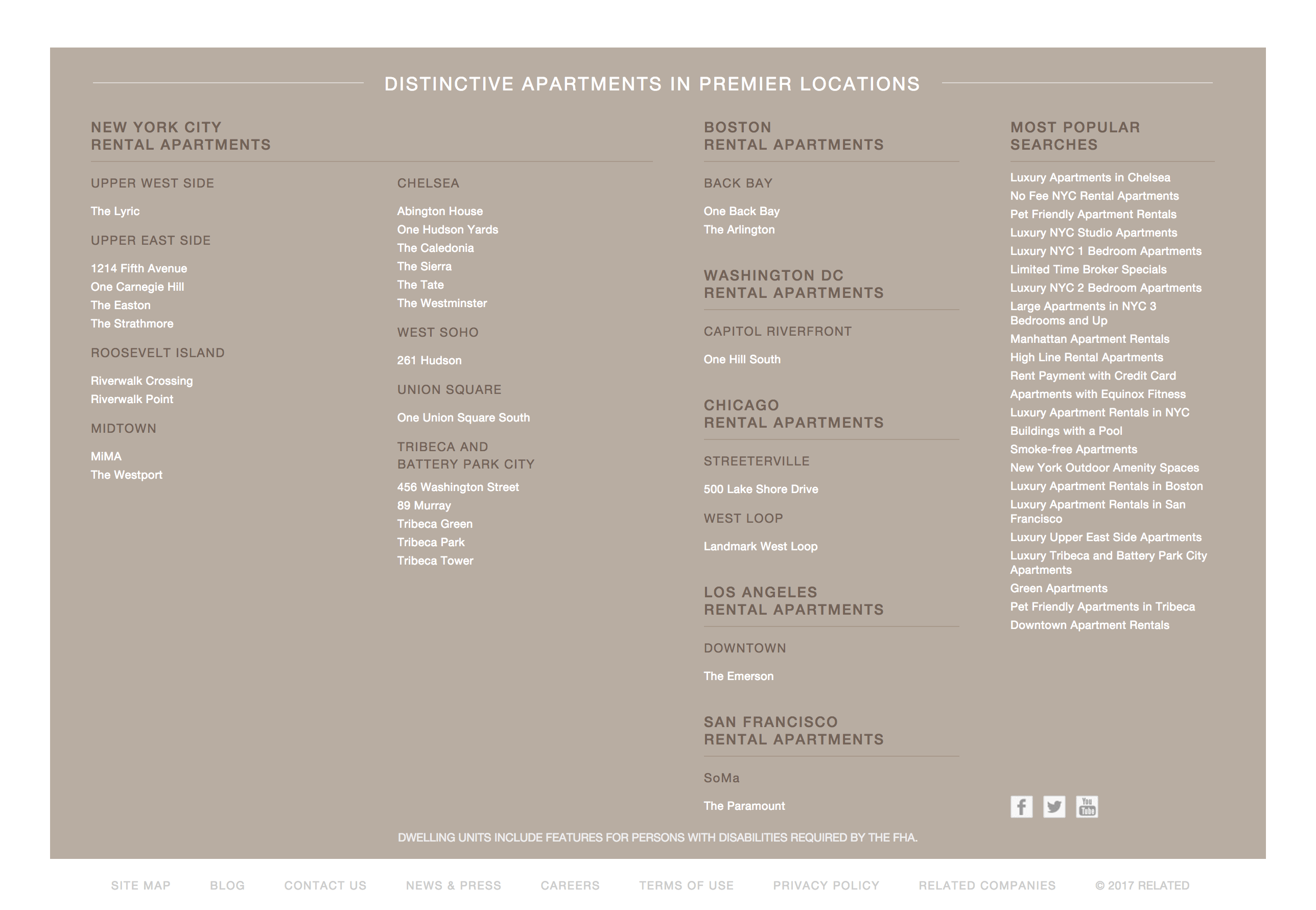
Marketing properties is priority #1. Users of course can find properties directly from the homepage. However, the site treated the property landing pages as the "real" homepages. The marketing campaigns led directly to individual properties pages, and the navigation schema encouraged users to discover the other areas of the site. Browsing search results promotes exploration and discovery, with nearby or similar properties featured prominently. Property features and amenities are woven throughout the narrative.


Mobile
A mobile "m dot" site was created just for the relatedrentals.com experience. It was reasoned that Rentals prospects would find the most value in a mobile optimized experience while wandering through neighborhoods. Rather than a responsive design – which shares the same code base as the desktop site – and m dot experience allows for a completely different architecture and user flow. The "search" and browse "locations" paths took full advantage of this, featuring maps and special offers for free coffee in nearby properties. Content was dispersed through multiple steps vs in long pages as with the desktop version.
Marketing Campaign
My team created the marketing campaign concepts for the year, and executed on marketing touchpoints online and out-of-home. The concept was "Find Yourself Here" and we drew comparisons to the hustle and grind of living in New York vs. the quiet oasis you'd have while living in a Related property.
Kiosk Posters
Taxi TV Commercial
Picked up sweet awards too.
Client feedback was very positive, and we were later asked to design the award-winning HudsonYards experience. Accolades include the IAC Outstanding Achievement award.